- Published on
UA SDS Blog Development & Maintenance
- Authors

- Name
- Wilbur T. Wildcat
- @AZWilburWildcat
WARNING
This post is under development, so there may be errors or some sections may be unclear. Please let me know if you spot anything or have any questions/comments/concerns!
Now that you're up and running...
Welcome to your blog site!
If you're just starting, it probably looks fairly tacky. Thankfully it doesn't take too much effort to start making it your own.
This post will outline the elements of your site development and maintenance that you will care most about, how to do some customization, and generally what you will most often be tweaking to maintain.
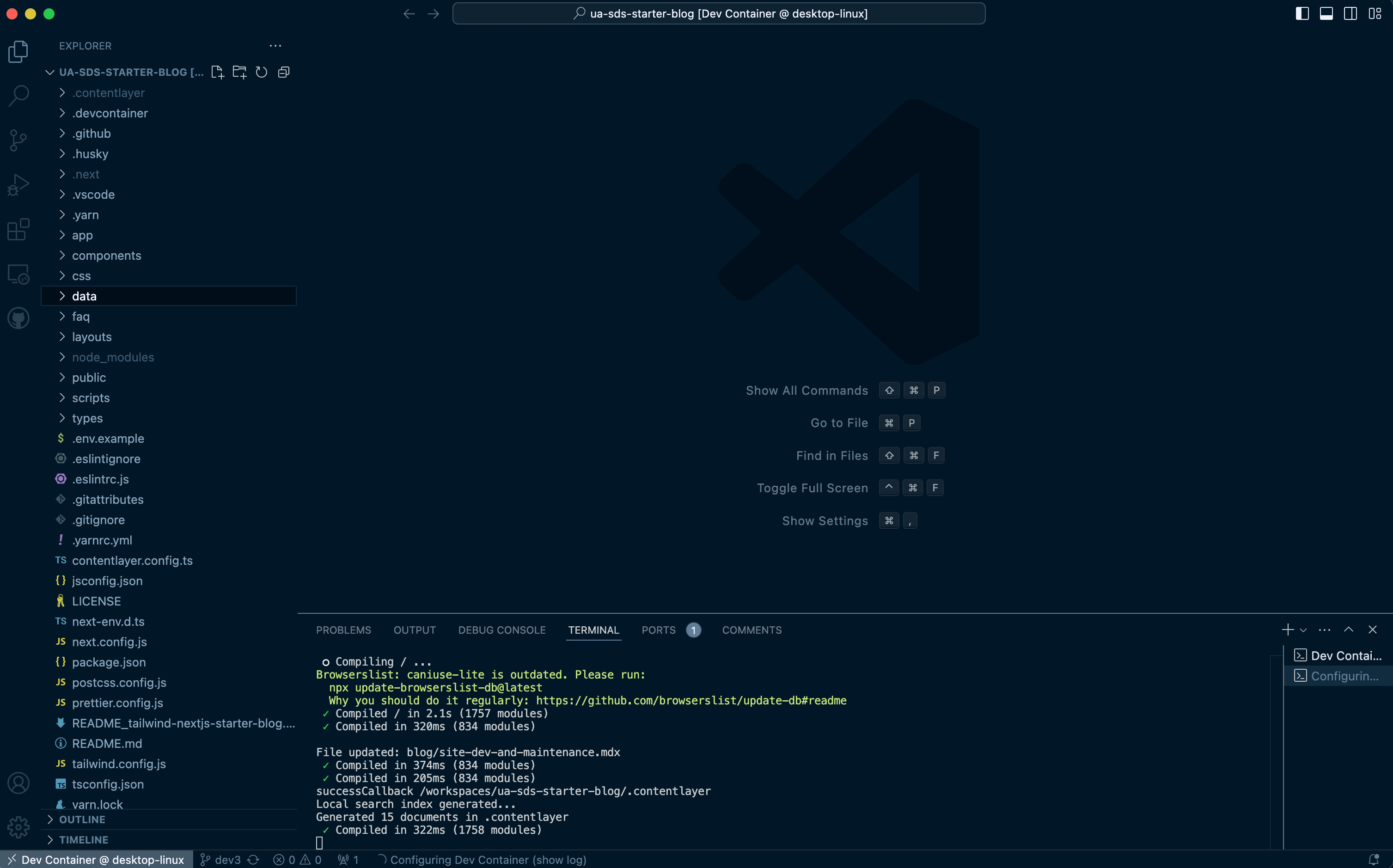
If you have just gotten everything up and running, your VSCode environment should look something like this:
How do I customize my site?
A quick explainer can be found here at @timlrx Tailwind Blog template README
This post goes into more detailed customization, and some items that are unique to this template.
Site Metadata
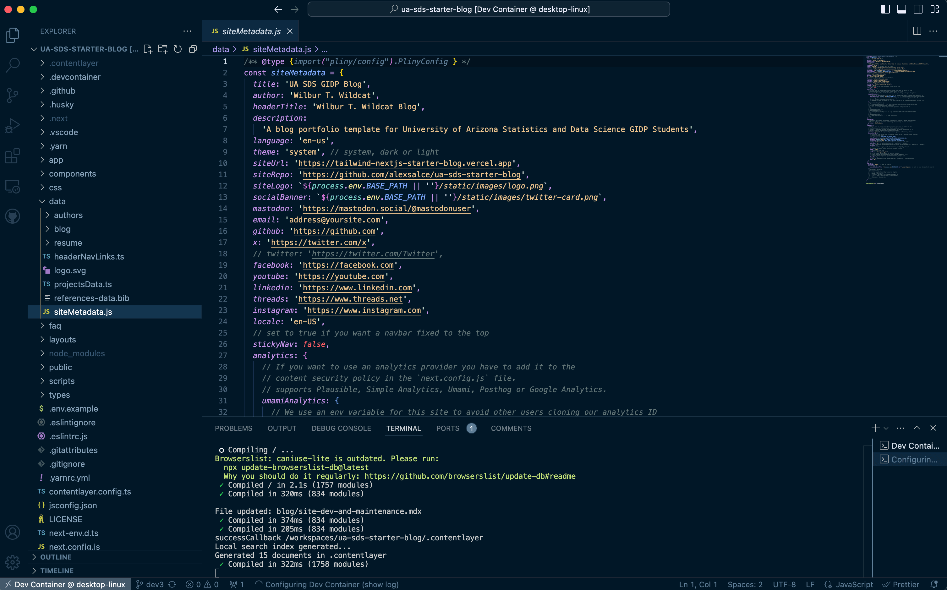
The first step in customizing your site is to personalize its metadata. In your Explorer window, navigate to the data folder and open siteMetadata.js.
Update your properties as you would like. Below is reference for the mapping of each property to the site.
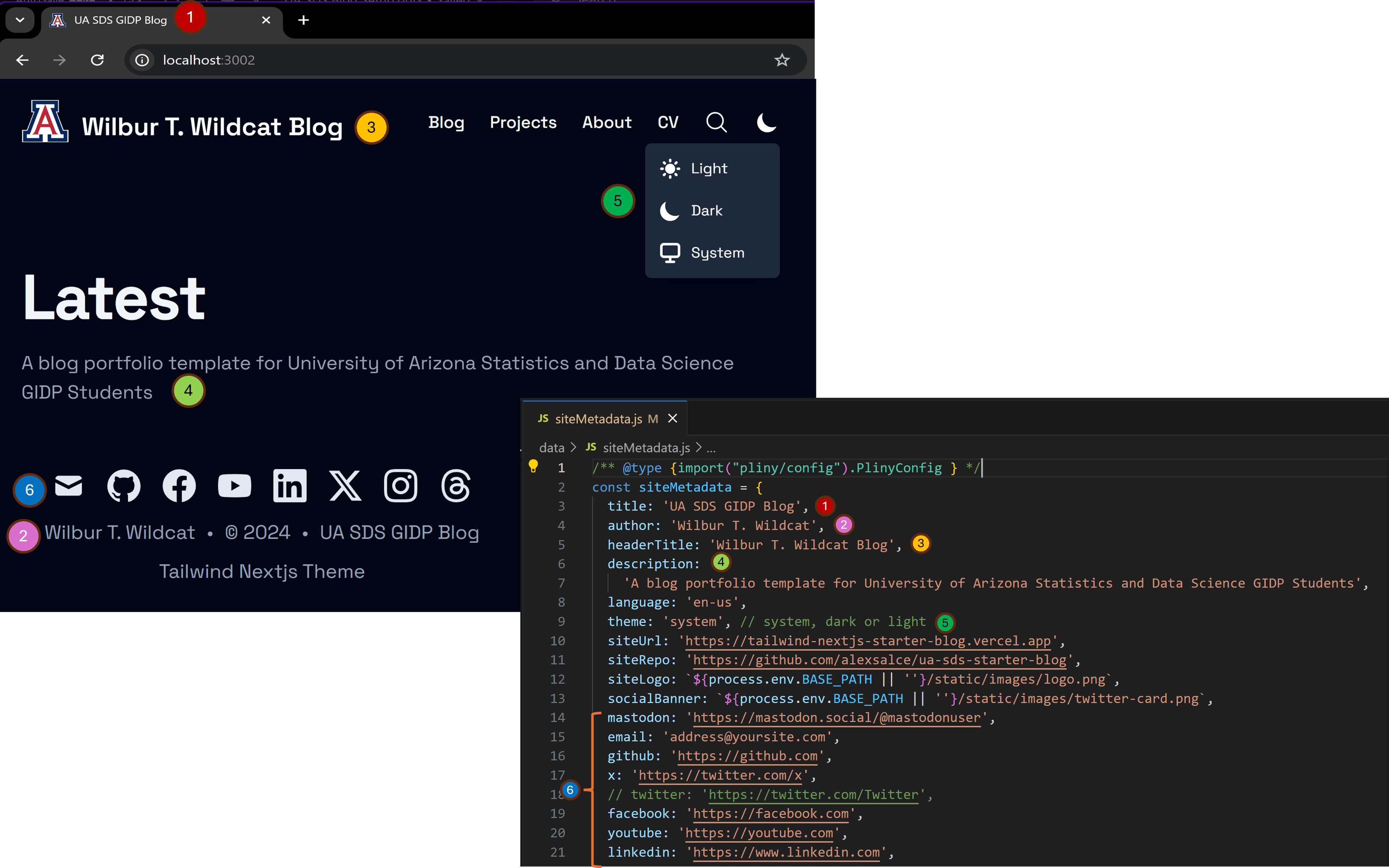
You can comment out any links that you don't want (6).
Use the stickynav logical property to set whether you would like your navbar to stick to the top while scrolling.
For analytics, newsletter, and comments, please see this @timrlx post.
Pictures and Icons
There are several files that comprise all of the logos and icons that you will care about for your site. We will reference this figure below.
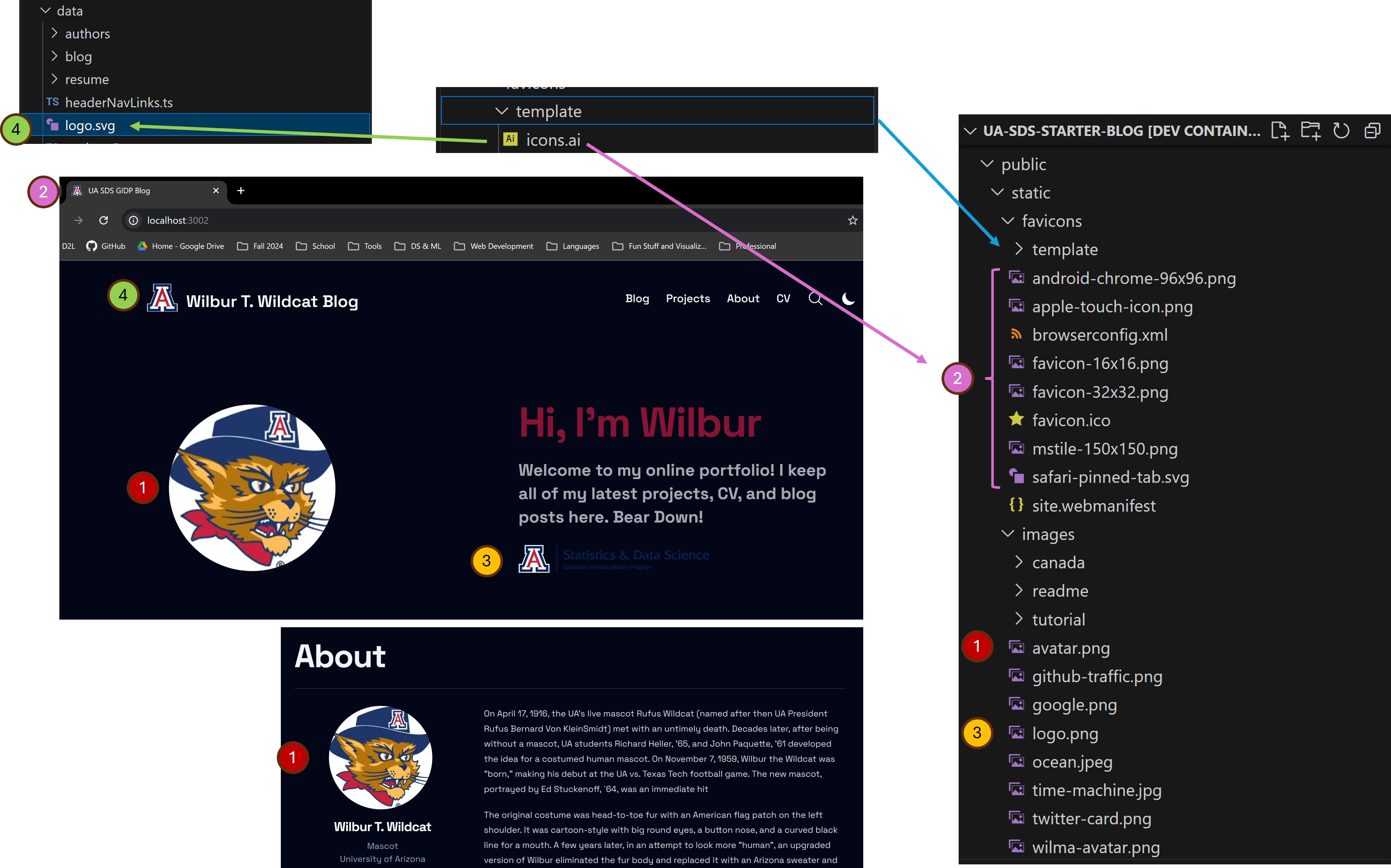
(1) To update your avatar photo sitewide, which is used primarily for your Author image and for the splash page hero, replace the avatar.png file in the public/static folder.
(2) The favicons require update if you want something other than the Block A logo. Unfortunately, I don't have a simple set of instructions here to update these without downloading the Adobe tools. Fortunately, if you are a student, you can get them for free here:
I have made an Adobe Illustator template, which can be found in the public/static/favicons/template directory, called icons.ai. It has premade canvases that can be used to export and overwrite each of the files in the favicons folder. Be sure to export the correct file type and the correct corresponding dimensions for each.
(3) public/static/images/logo.png is only used in the Hero, but it's also useful to have a logo file that can be used throughout the site. It's also used in the siteMetadata.js as a site logo parameter, although I am not clear how it is used in the web app.
(4) In the data folder, logo.svg should be changed to your logo if you would like something other than the Block A, but it must be an SVG file. The template in public/static/favicons/template also has a canvas to export your own logo as an SVG. This logo will be on your navbar, and can be used anywhere else on your side by the same method used in components/Header.tsx.
Colors
Site Colors
The site's color schemes are dictated by CSS (namely in css/tailwind.css), however the primary hooks for changing colors across the board can be found in the tailwind.config.js file in the root directory. You will primarily want to edit the colors property in the module_exports (should be lines 27-30).
colors: {
        primary: colors.rose,
        gray: colors.slate,
      },
primary will primarily affect text, links, etc. gray will affect dark mode colors including the background. You can use the color palettes defined by Tailwind CSS to make quick "broad strokes" updates:
Of course, all of the CSS is customizable, so any fields in tailwind.config.js as well as css/tailwind.css can be modified to change the overall looks of the site.
Code Chunk Colors
The css/prism.css CSS file is dedicated to the styling of code chunks. There are great themes available at this repo if you want to try something different than the template:
Fonts
There are two steps to modifying the default font for the site.
The first step requires opening app/layout.tsx. For reference, we can look at how to import the default font Space_Grotesk.
import { Space_Grotesk } from 'next/font/google'
// ...
const space_grotesk = Space_Grotesk({
  subsets: ['latin'],
  display: 'swap',
  variable: '--font-space-grotesk',
})
We can choose a font we want from next/font/google, see the below documentation.
Once we create a variable for our chosen font, the default font for the site can be modified using the fontFamily property in tailwind.config.js.
      fontFamily: {
        sans: ['var(--font-space-grotesk)', ...fontFamily.sans],
      },
Blog Posts, Authors, and CV
Blog Posts
All of the mdx files in your data/blog folder will render to your site automatically. Any posts that you don't want on your site should be removed or moved to the data/archive/blog folder.
To make a new post, create a new mdx file in data/blog. You will need to add the header fields in order for everything to render. Use the other posts in the folder as reference, or check out the example for how to format a blog post header here:
Blog posts are markdown, and very similar to other kinds of markdown that you have seen. You can even use to render equations. I recommend opening the data/blog/deriving-ols-estimator.mdx post to see examples of how the syntax works in posts.
Additionally, the Next.js framework allows us to incorporate components in your blog posts by passing component objects to be available in blogs via the components/MDXComponents.tsx. There are a wealth of great components out there that can make your blogs more animated, reactive, and interactive. See this part of the post for more on this.
If you want to take a look at some examples, feel free to check out any posts on my live page.
Authors
Be sure to update the data/authors/default.mdx page with all of your information. This will update your About page, so make sure to hit all of the high-level points and contact information about you (you can also have a look at mine for ideas).
CV
You can customize your CV by modifying the data/resume/default.mdx file, using the template as guidance for formatting (it's just pretty simple markdown syntax). Keep in mind that the header levels correspond to indents in a table-of-contents style sidebar on the CV page.
Deploying Git Repositories with Vercel
IMPORTANT
UPDATE AS OF DECEMBER 2024: Vercel now uses Node.js version 22.X as its default for new projects when running yarn build, meaning that the first time you deploy it will fail! This is fine, let it fail! Once the build has failed, navigate to the Project page on Vercel and click on the Settings tab (above your project's name). Scroll down to "Node.js Version" and from the pulldown menu select 20.X (the default will have 22.X). Click the Save button below, then go back to the Project tab. Click Redeploy, don't modify any options on the pop up and redeploy the page. This time it should build successfully. See this link if you get stuck: https://vercel.com/docs/functions/runtimes/node-js/node-js-versions
Time to start deploying!
More Advanced Stuff
WARNING
This is where it gets a little heavy
MDXComponents
Here is the tutorial that comes from the original blog template by @timrlx.
How can I add a custom MDX component?
Here's an example on how to create a donut chart from Chart.js (assuming you already have the dependencies installed) and use it in MDX posts. First, create a new DonutChart.tsx component in components:
'use client'

import { Doughnut } from 'react-chartjs-2'
import { Chart as ChartJS, ArcElement, Tooltip, Legend } from 'chart.js'

ChartJS.register(ArcElement, Tooltip, Legend)

const DonutChart = ({ data }) => {
  return <Doughnut data={data} />
}

export default Doughnut
Since the underlying Doughnut component uses React hooks, we add the 'use client' directive to specify that it is a client side component. Also, there is an existing issue which prevents named components from being used, so we need to export the component as the default export.
Next, add the component to MDXComponents.tsx:
...
+ import DonutChart from './DonutChart'

export const components: MDXComponents = {
  Image,
  TOCInline,
  a: CustomLink,
  pre: Pre,
+  DonutChart,
  BlogNewsletterForm,
}
You can now use the component in .mdx files:
## Example Donut Chart

export const data = {
  labels: ['Red', 'Blue', 'Yellow'],
  datasets: [
    {
      label: '# of Votes',
      data: [12, 19, 3],
      backgroundColor: [
        'rgba(255, 99, 132, 0.2)',
        'rgba(54, 162, 235, 0.2)',
        'rgba(255, 206, 86, 0.2)',
      ],
      borderColor: ['rgba(255, 99, 132, 1)', 'rgba(54, 162, 235, 1)', 'rgba(255, 206, 86, 1)'],
      borderWidth: 1,
    },
  ],
}

<DonutChart data={data} />
Layouts, Components, and Pages
If you take a look at the blog template from which this was originally created...
...you'll notice a difference in the layout of the landing page.
Each page is rendered from Typescript files in the app folder, namely app/layout.tsx which controls the overall layout of the whole site, and in the case of the landing page, app/Main.tsx.
If we open app/Main.tsx we can see where I manually placed a 'Component', the SDSHero.
// ...
// import custom SDSHero (sds_custom)
import SDSHero from '@/components/SDSHero'
// ...
export default function Home({ posts }) {
  return (
    <>
      <SDSHero />
// ...
The SDSHero Component is a very simple custom component that I created for the site, and I suggest you open it and have a quick look. Next.js is an object-oriented framework, and Components are objects that are importable throughout layouts in the web app that get rendered dynamically using contentlayer.
If we, for example, want to remove the SDSHero from the landing page, we can just comment out or delete it from app/Main.tsx.
When we want to make a new page for our site (maybe something different than a blog, or an about me page), it needs to be defined in the app folder with a subdirectory that contains a page.tsx file, which defines all of the imports, layouts of all the components, just overall what the page should look like. It also needs to be instructed to be rendered with contentlayer. We make the structure of the new page we want in our web app in the app folder, and then we must modify contentlayer.config.ts in the root folder. We may also need some css and components to help make it render the way we want.
Resume Example
The app/resume layout was a custom layout that I added to this site (credit to Trillium's Blog for the code), and we can run through how it was created. First, we will create a new directory in our app folder. Here, we use app/resume. Inside this folder we will make a page.tsx. This page is what ultimately get rendered when we navigate to {blogurl}/resume.
In this case, the page.tsx that I copied from Trillium's Blog uses some dependencies that will also need to be accounted for.
- We need a Resume Layout, which is a layout that can be found at
layouts/ResumeLayout.tsx. This was something that I added manually, and you may need to create your own layout if you are making a new page. - The
ResumeLayoutneeds a custom componentimport { ToC } from '@/components/ToC'. This was also something I added manually, and you may need to import components into your layouts.
NOTE
Always check the imports of any new components, layouts, or any other pages that you decide to add if you are importing from externally (maybe you found something cool online). If you don't recognize an import, or you are getting errors when you render, you will need to install the dependency into your environment. You can stop the dev server and install from your terminal using yarn add {package} or npm install {package} (documentation online will usually give you something you can copy/paste). Most packages can be found on https://www.npmjs.com/. Also note, when you install new packages to your project, the package.json updates automatically, so that dependency will now be automatically attached to your environment for this project.
- Lastly, we need to create a new directory,
data/resumeand adddefault.mdx. This will be the content that we fill out for the resume layout object that gets rendered on the app page.
Once these files are added in their appropriate folders, we need to pass the structure into contentlayer so that it will be dynamically rendered.
Inside of contentlayer.config.ts in the root, we need to add a new export so that contentlayer will export our resume to be rendered by the app. Notice the filePathPattern property where we define the path to the mdx content that will be rendered and define the fields that can be defined in the header and passed into the layout.
//need to add Resume contentlayer configuration, any new react app page needs added here, use others for format (sds_custom)
export const Resume = defineDocumentType(() => ({
  name: 'Resume',
  filePathPattern: 'resume/**/*.mdx',
  contentType: 'mdx',
  fields: {
    name: { type: 'string', required: true },
    avatar: { type: 'string' },
    occupation: { type: 'string' },
    company: { type: 'string' },
    email: { type: 'string' },
    linkedin: { type: 'string' },
    github: { type: 'string' },
    layout: { type: 'string' },
  },
  computedFields,
}))
Almost there. Our last step is to add the Resume export we just created to the contentlayer documentTypes so that contentlayer knows to generate it.
// documentTypes: Resume must be manually added for document type export for react app page to build (sds_custom)
export default makeSource({
  contentDirPath: 'data',
  documentTypes: [Blog, Authors, Resume],
And we're done! Now, when we navigate to {blogurl}/resume, we will render our new page!
Also, you might notice on the nav bar it's called CV, and on the layout document it says "Cirriculum Vitae". You can of course modify this, but I chose CV since that matches the communications requirement. An exercise you may try: how do I produce this Resume page at {blogurl}/cv?
NOTE
I will be adding to this page periodically, and I am happy to add any material by request!